Color Your World: How to Choose the Perfect Color Palette for Your Dream Home

Choosing the right color palette for your house is a crucial step in creating a home that reflects your personal style and creates a welcoming environment for you and your family. The right colors can transform your space and make it feel like a true sanctuary, while the wrong choices can leave you feeling uninspired and unenthused.
But with so many options out there, it can be overwhelming to know where to start. That's why in this blog post, we'll guide you through the process of choosing the perfect color palette for your dream home. From understanding color psychology to exploring trending color schemes, we've got you covered.
So whether you're renovating your current space or starting fresh in a new home, grab a cup of coffee, settle in, and let's dive into the wonderful world of color!
Let's Dive into the World of Basic Colors
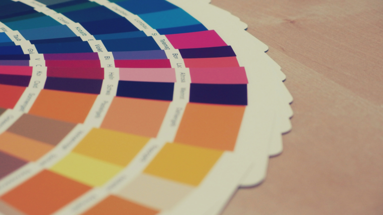
Let's start with the basics by understanding the Color Theory, mixing, and psychology Before choosing the perfect color palette.
Color Theory
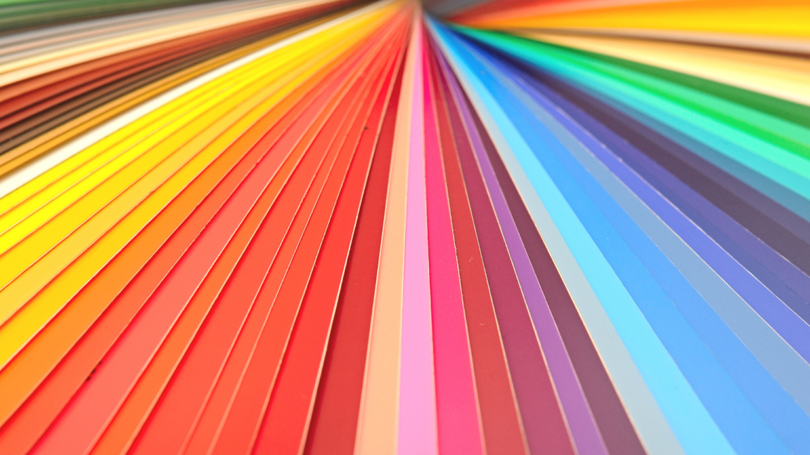
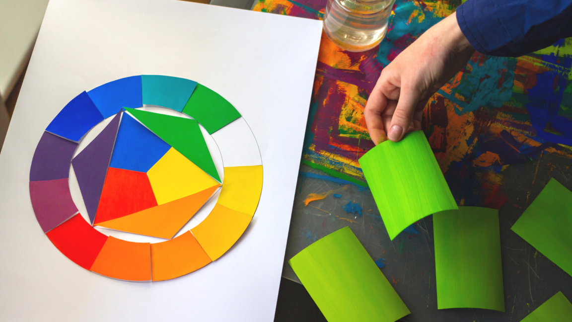
The first topic we'll cover is about color and color theory. Color theory refers to the theory of the origin of various colors, which are based on the primary colors of red, blue, and yellow. Mixing these colors together creates a color wheel, which is divided into warm and cool tones. In addition, if colors are continuously mixed, it can create an endless range of other colors.
Impact of Colors on Emotion
Colors have been found to have an impact on our mood, as various studies have shown. It's easy to observe this phenomenon in action. When we spend time in green surroundings, such as a park, we tend to feel relaxed. This is because the color green is known to have a calming effect on us. Colors can have a profound impact on our emotions, with the strength of this impact increasing as the number of colors in our environment increases. Additionally, our eyes are naturally drawn to colors that are more prominent, further amplifying their impact on our mood.
Color Psychology
Color psychology has a fascinating influence on how humans perceive and feel. Nowadays, this concept is widely utilized in various fields. Colors can be broadly classified into two categories: warm and cool tones. To understand how color can impact our emotions, let's briefly delve into the topic.
Warm Colors
- Red

Red is a color that has a remarkable ability to capture attention due to its striking and bold nature. It creates an intense and exciting vibe and is closely linked to strong emotions like power, courage, passion, and anger. However, it can also signify danger, so it should be used with caution. The color red is often associated with liveliness, excitement, and happiness, making it a great choice to add energy to any design or space.
- Orange
The color orange is a warm hue that is created by adding more yellow to red. It's often associated with positive attitudes, joy, and self-assurance. Additionally, it can inspire people to feel motivated, brave, energetic, and lively. Interestingly, the color orange has been known to stimulate appetite as well.
Medium-warmth colors
- Yellow
This color is associated with the mind and intellect, and is often considered a representation of creativity due to its lightness. It can bring brightness, hope, happiness, fun, joy, playfulness, and warmth to any design or setting. However, it's important to note that excessive use of this color can indicate confusion, anxiety, and fear.
- Purple
Purple is another color that falls in the middle tone range. It is commonly associated with qualities such as nobility, wealth, thoughtfulness, and depth. Additionally, it is often used in high-end products.
Cold Colors
- Royal Blue/Cobalt Blue

Royal or Cobalt Blue is a color that is often associated with feelings of calmness, tranquility, and stability. It has a cool and collected vibe that can provide a soothing effect. As the opposite of red, blue can evoke a completely different range of emotions. Additionally, this color is linked with the ideals of conservationism and peace, which can help reduce stress and promote relaxation by slowing down the heart rate.
- Baby Blue

Baby blue is a tone that is closely associated with the color blue, and it is known to evoke a sense of calmness, comfort, freshness, and relaxation. Despite this, it still retains a coolness factor.
- Green
Green is a color that symbolizes nature and a sense of calmness. It is known for being environmentally friendly and representing balance, growth, peace, and safety. It is also associated with preservation. When it comes to shades of green, darker tones are often associated with wealth, money, and prestige, while lighter tones represent growth, renewal, and freshness.
Popular color palettes for houses
When it comes to the color palette, it all depends on your personal tastes and preferences. However, at the same time, some colors work even better than others for their own reasons. Here, before we show you the specific colors in detail, are the color tones:
- Pales: Saturated, yet fresh and pleasing to the eyes.
- Neutrals: Naturalistic, earth-toned colors.
- Whites: Cleanliness and simplicity to the eyes.
- Deeps: Uniqueness like no other house decoration.
White
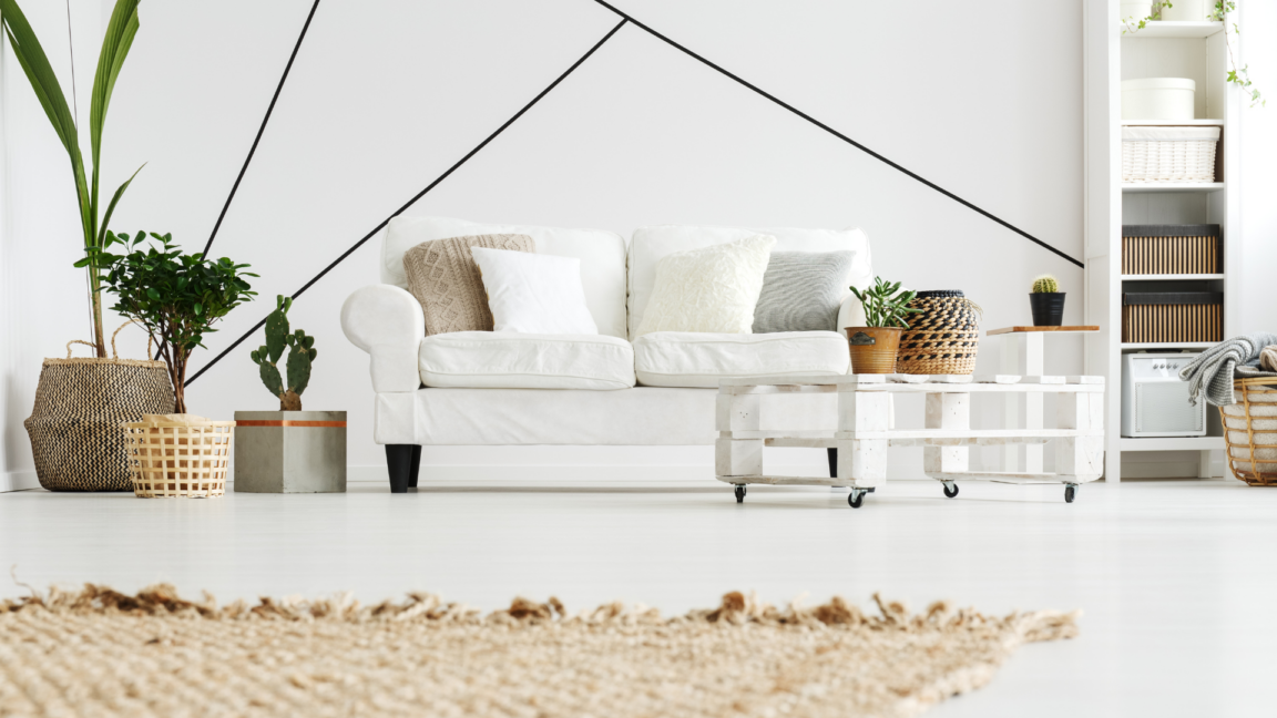
When it comes to home decorating, it's difficult to think of any other color that could replace white as the first choice. White is a crucial color in home decorating, serving as a foundation on which other colors can be built upon. It can be used as a primary color or a secondary base, making it easy to achieve the desired hue.
Moreover, the color white can create a sense of brightness, relaxation, and spaciousness in a room. Because of its neutral quality, a room painted in white can be styled in a multitude of ways, such as minimalist, modern, sweet, hip, and more.
If you prefer a clutter-free look, you can always adorn your space with potted plants to introduce some green tones to your white decor. This will make the green hues pop against the white backdrop.
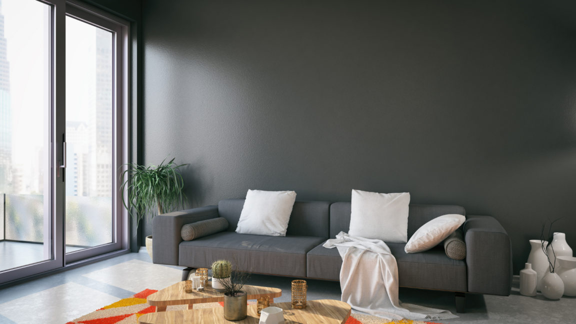
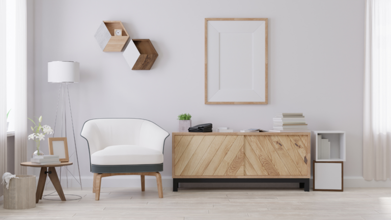
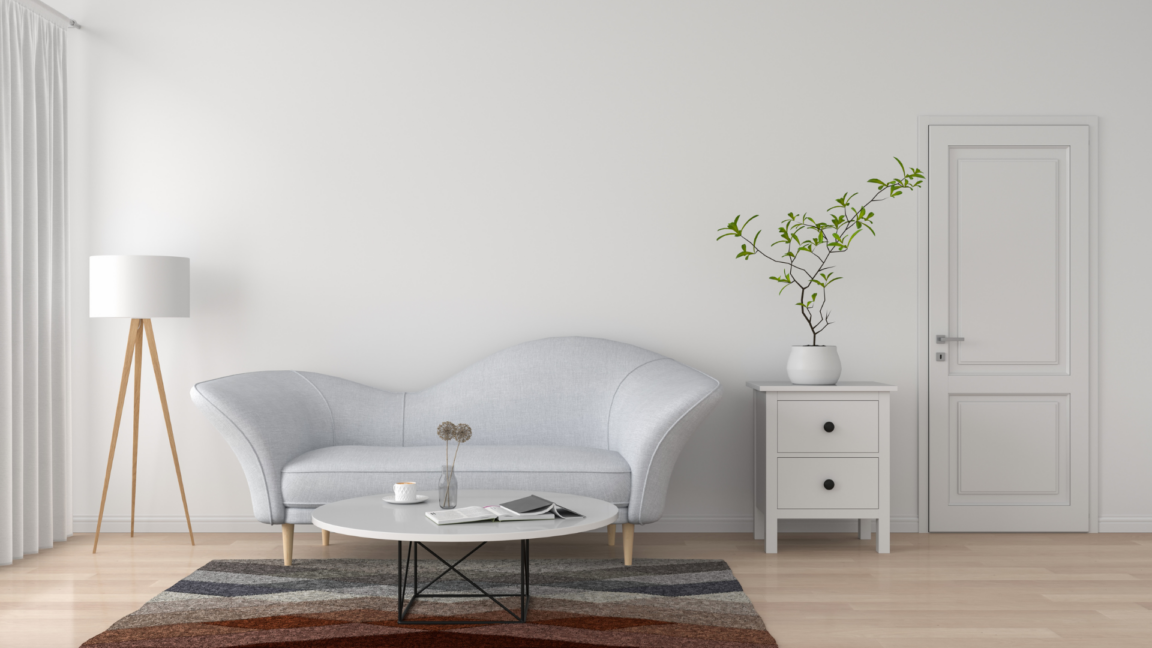
Brown
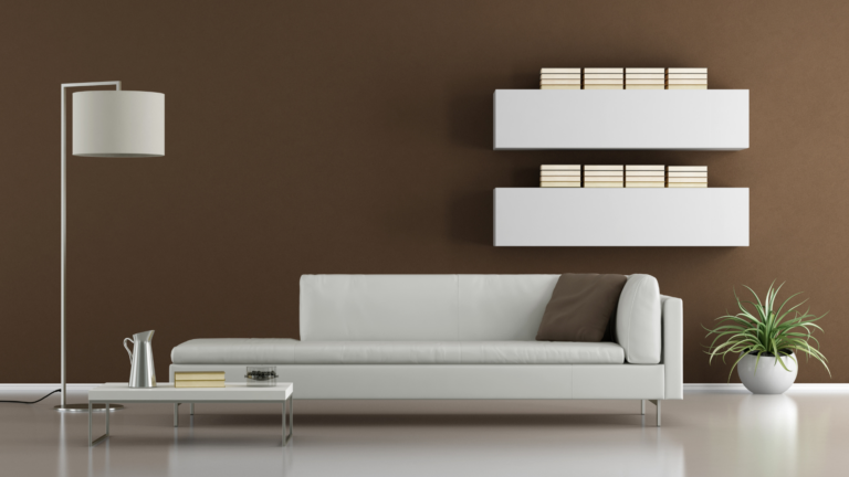
For warmer preferences, the color brown is a perfect choice with its soothing and comfortable ambience that appeals to many. Furthermore, aside from its wide-appealing ambience, brown is often paired with white as seen in this image, for example.
Using brown as your primary color adds a touch of luxury and sophistication to your home, especially if you favor a modern luxury style. To achieve this look, we suggest using an Antique tone combined with warm light colors. Additionally, incorporating European-style furniture can enhance the overall design, giving your home an elegant Antique European flair.
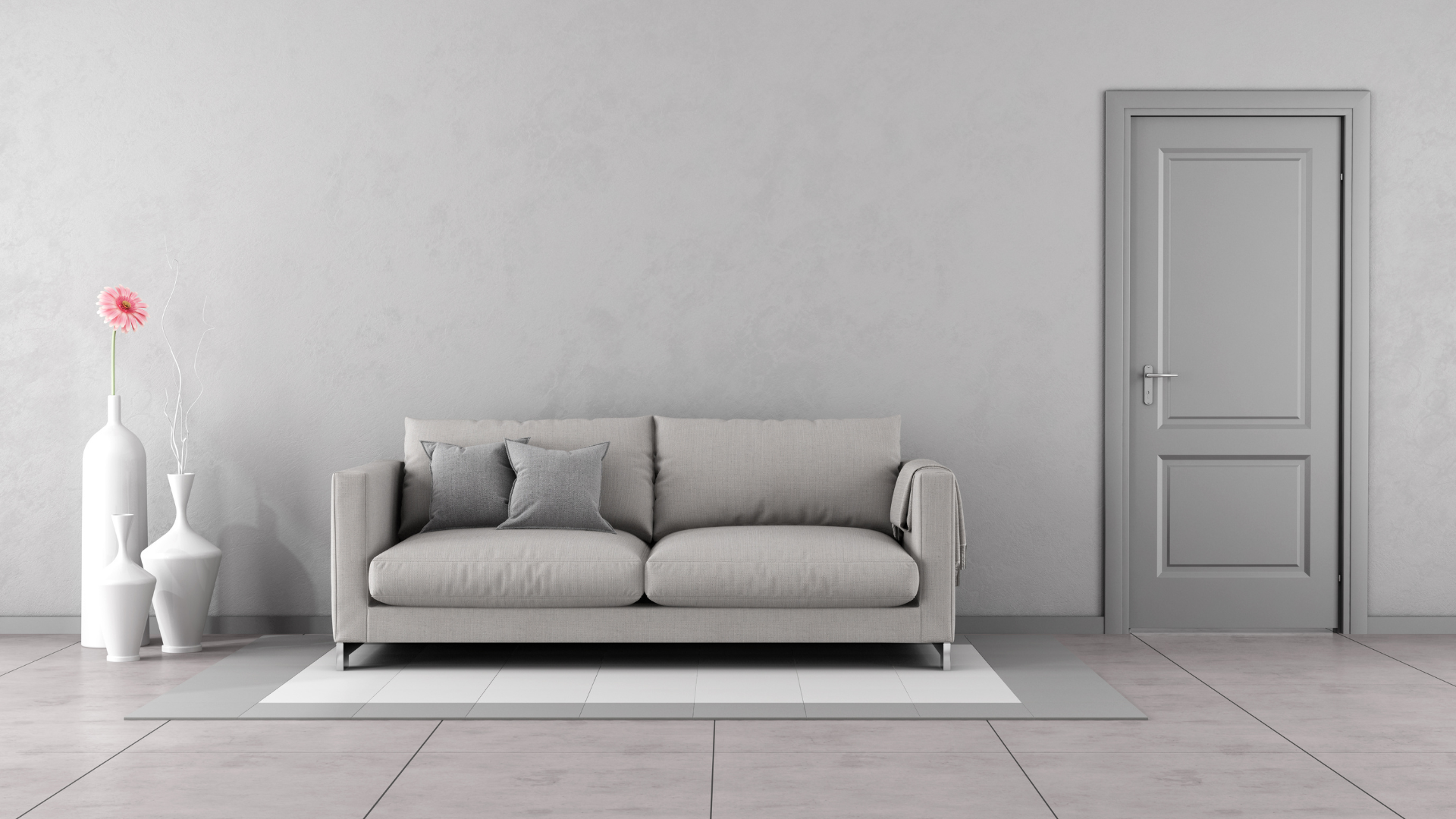
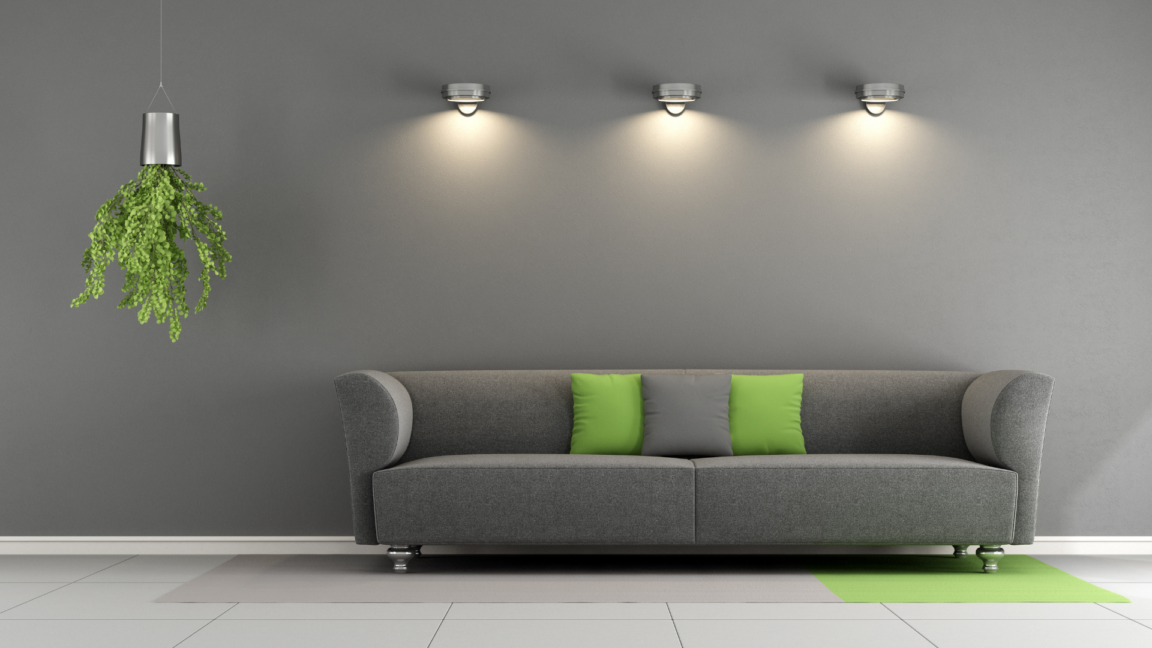
Grey
In recent years, grey has become a go-to color for homeowners. It's a versatile and trendy color that can be paired with various furniture styles, just like white. The grey tone is perfect for those who prefer a minimalist, modern, and simple style in their home décor. Furthermore, it's an excellent option for beginners, with a wide range of grey shades available to choose from.
- Light Grey
For instance, colors like dusty lavender, ballet pink, or sky blue can create a calming and relaxing atmosphere that makes your room more inviting. They can easily blend in with other color tones as well.
- Medium Grey
Medium grey is an Earth Tone color, not too dark nor light and can be both warm and cool-toned. Examples of Earth Tone colors are Clay, Sand and Ochre, and Slate. This color tone can easily blend with different lighting conditions.
- Greyish White
Greyish white is closer to white in hue while also not as light as the aforementioned lighter grey tone. It has around 40% grey tone, making it blend well with different room decor. It's also a comfortable and clean color tone that fits with any design.
- Dark Grey
Dark grey emphasizes more on creating a bold and dimensional look than light tones. It also helps to add energy and confidence to the room, making it more empowering for the residents. Onyx is an example of this color tone.
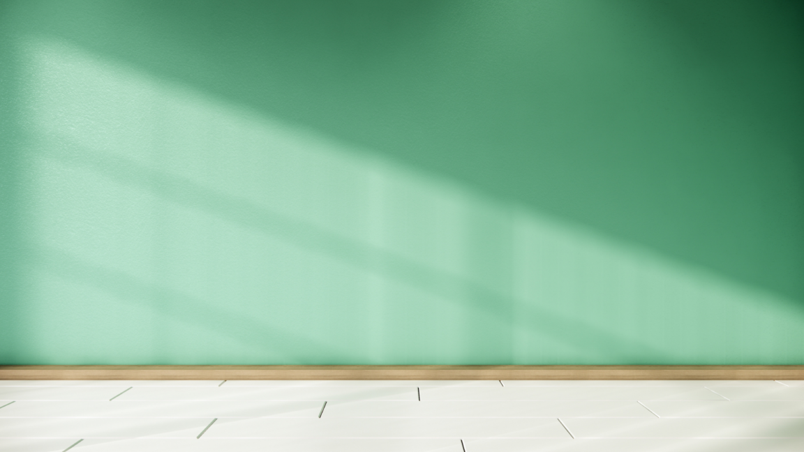
Naturalistic Green
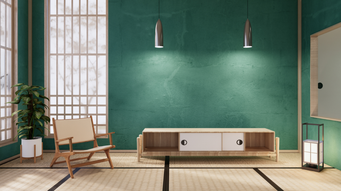
If you're looking to create a calming and nature-inspired atmosphere in your home, green is the perfect color choice. Symbolizing abundance and taking on the color of trees and grass, green has a unique ability to soothe the mind and soul.
When choosing a green color tone for your home, it's important to consider the balance of color warmth and saturation. A bluish-green hue is a popular choice as it strikes the perfect balance, providing a cool and calming effect. Additionally, decorating with green can add a touch of vintage charm to your space.
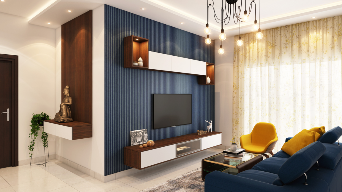
Peaceful Blue
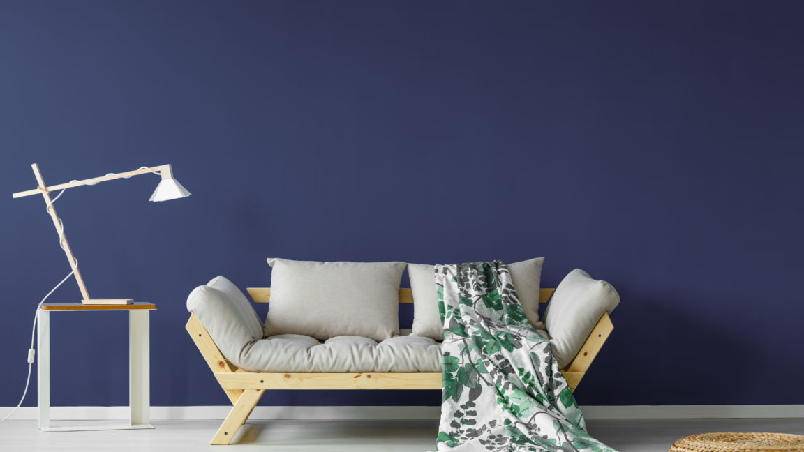
And we see naturalistic colors once again with the color blue, taking on the color of the oceans as well as symbolizing peaceful and stability.
Many people may think that the color blue is difficult to use for home decoration, but in reality, it's easier than you think. You just need to incorporate other colors such as white, gray, gold, and beige. However, using too much blue may make the room look dark, so it's important to use other colors or windows to bring in more light.
Color Selection Tips & Tricks
Once we've explored some captivating color schemes for home decoration, it's important not to overlook the crucial tips for selecting the perfect house paint colors. Choosing a color palette for your home goes beyond simply picking a color, as it involves multiple considerations such as the color's age, the intended use of the space, harmonizing with furniture, achieving a desired style, and much more. To make an informed decision, it's essential to take your time and thoroughly assess all of these factors.
- The 60-30-10 Ratio
Usually, the basic standard formula for painting is to use the 60-30-10 or 6:3:1 ratio. This is a very popular paint ratio that many people choose to use, whether they are beginners or top-level designers. It all starts with...
- 60%: One color for the base and primer.
- 30%: Darker colors for striking presentation.
- 10%: Highlights on windows and furniture
This method will make the room look more dimensional and playful, and prevent it from feeling too cramped. Additionally, it allows for a beautiful balance of color. The main color, which makes up 60% of the palette, should avoid walls, windows, or furniture that dominate the space. To summarize:
| Percentage | Color Type | Coverage/Usage |
| 60% | Primary Color | Majority |
| 30% | Darker/Brighter Color | Highlighting one wall |
| 10% | Different Color | Furniture, windows, or other items (for color highlights) |
- One Color also Works
Playing with colors like this doesn't mean the room has to be just one color. Instead, we can use the color to create a gradient of light and dark tones, either in a monochromatic or two-tone style, both for interior and exterior painting. This technique helps to create an attractive and captivating style, providing a sense of fullness and satisfaction. If the room is well decorated, it can even turn into a miniature art gallery!
- Compare and contrast the colors before selections

Choosing the right colors for your home decor is crucial, as it can completely transform the look and feel of a room. That's why it's essential to take some time and consider different color options before making a final decision.
One effective way to compare color tones is by using a color palette. A color palette helps us see the different color tones clearly and make informed choices. Once you have decided on a main color, you can then choose complementary or similar color tones to complete your color scheme.
Some stores also provide actual wall samples that you can use to see the color in real life. This can help you be certain that the color you have chosen is the right one for you. However, if you're still unsure, we recommend eliminating the colors you don't like first to make your choices clearer.
By taking the time to consider different color options and comparing color tones, you can create a color scheme that will give your home a cohesive and stylish look.
- Choose the right colors and lighting type
Getting the right colors for home decoration is important, but it's also essential to consider the lighting as it affects how the colors appear to our eyes. Furthermore, each light tone has a different impact on our mood and feelings.
For instance, when choosing paint colors for a room, we need to assess how much natural light the room receives. If the room has ample natural light, we can go for any color we like. However, if the room lacks natural light, we recommend going for brighter hues instead of darker ones.
Regarding color mixing with light, typically, there are three light tones: white light, daylight, and warm light. Each tone provides a different color tone. For example, warm light emits a yellowish hue, making the chosen colors appear warmer. In contrast, white light or fluorescent light creates a cooler and harder look.
**Lighting selection also plays a role in the size and width of your room
Contributing Factors
Moving on to this point, we would like to recommend factors that are related to color selection. The factors for choosing colors in home decoration must include other related factors because a room does not only consist of the room itself, light, and color. There are other things to consider as well.
- Furniture type & color
As we have discussed earlier, when it comes to decorating a room, there are more factors to consider than just the lighting and colors. Furniture is a crucial element that can either enhance or disrupt the harmony of your chosen color scheme. It is essential to carefully select the right furniture colors that will complement your paint choices. For instance, if you are going for a minimalistic room, you need to ensure that the furniture aligns with this style, but ultimately, it's up to your subjective preference to make it work.
- Color properties
House paints have many components, ranging from those with strong chemical compounds to those with minimal chemicals. This can affect the odor of the paint. A room or house with a strong paint odor may not be as pleasant to live in. Additionally, each brand of paint has its own unique characteristics, as advertised. For example, there are colors that can prevent bacteria and fungi, colors that will not fade when exposed to water, and colors that are easy to clean stains off of.
- The color of the Roof
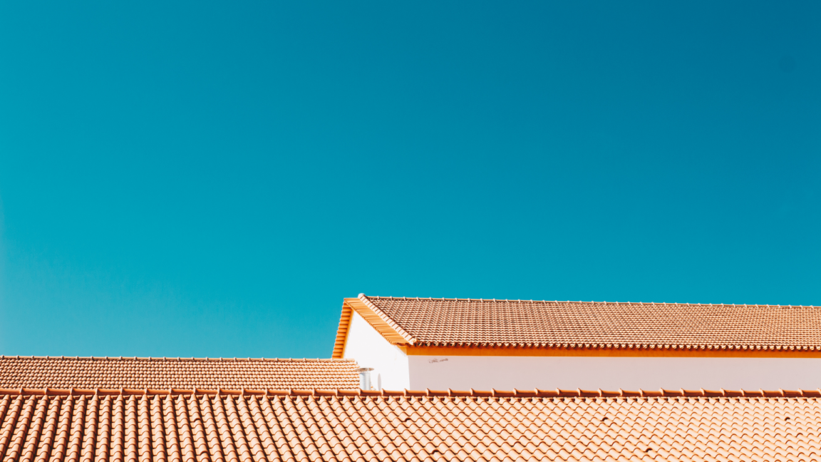
Another thing to consider is the color of the roof. When it comes to painting a house, we not only need to consider the environment but also the color of the roof. Often, we don't build a house from scratch, but instead, we buy a completed house that requires decoration. Therefore, the color of the roof is another thing that we cannot choose. Matching the color of the roof with the color of the house is highly recommended.
Why Color Selection Matters
Choosing the right colors for your home decor is crucial as it can make a significant difference in the overall feel of your home or room. Not only can it create a pleasant environment to live in, but it can also have an impact on your mood and emotions. Imagine feeling uneasy instead of relaxed and happy just because of the colors you chose.
By selecting the appropriate colors from the beginning, you can save yourself money in the long run. You won't have to replace or repaint furniture to match new colors, and you'll avoid the hassle of having to find temporary accommodations during renovations. However, if you decide to change the colors down the line, it can be a time-consuming and expensive process.
It's important to take the time to consider the colors you want for your home decor carefully. Doing so will help you create a space that you'll enjoy living in and that reflects your personal style. Whether you're starting from scratch or updating an existing space, choosing the right colors is an essential step towards achieving the perfect look and feel for your home.
Conclusion
In conclusion, choosing the right color palette for your dream home is a crucial aspect of interior design. It can make a significant difference in the overall atmosphere of your space, affecting your mood and emotions. By considering factors such as natural lighting, room size, and personal preferences, you can create a color scheme that reflects your unique style and personality while also making your home a more inviting and comfortable place to be. So go ahead and experiment with different colors and combinations until you find the perfect palette that truly represents your vision for your dream home. Happy decorating!
Find your ideal property, available for sale or rent in the best prices possible, or list your property for sale or rent here. Alternatively, if you have any further questions, please get in touch with us:


